
Basic Brand Elements Guide
This guide covers the two building blocks of the brand: typography and color. Exact sizes flex by asset, but the typefaces, weights, and palette below stay consistent everywhere the brand shows up.
For full details visit BASIC BRAND ELEMENTS GUIDE.PDF
Typography
Headlines: IvyPresto Display
All headlines are set in IvyPresto Display. Sizes are not fixed; set them per asset.
- Display headlines: IvyPresto Display, Thin
- Display italic headlines: IvyPresto Display, Thin Italic
- Smaller headlines: IvyPresto Display, Light
- Emphasized phrases within a headline: IvyPresto Display, Light Italic
Body copy: Special Gothic
Body copy is Special Gothic, Regular. Size is determined by the asset, but it should always be readable and never smaller than 8 pt. Set the leading (line spacing) so paragraphs read comfortably, not cramped.
- Special Gothic Regular in all caps works as an overline or label.
- Use the 500 to 600 weight to add emphasis within body copy.
Eyebrows and section headers: Special Gothic Expanded
Eyebrows and section headers use Special Gothic Expanded, Medium, set in all caps with wide letter tracking. Size is determined by the asset.
Quick reference
| Use | Typeface and weight | Notes |
|---|---|---|
| Display headlines | IvyPresto Display, Thin | Size set per asset |
| Display italic headlines | IvyPresto Display, Thin Italic | Size set per asset |
| Smaller headlines | IvyPresto Display, Light | Size set per asset |
| Emphasized phrases in headlines | IvyPresto Display, Light Italic | Size set per asset |
| Body copy | Special Gothic, Regular | Never smaller than 8 pt, comfortable leading |
| Overlines and labels | Special Gothic, Regular, all caps |
|
| Body emphasis | Special Gothic, 500 to 600 weight |
|
| Eyebrows and section headers | Special Gothic Expanded, Medium | All caps, wide tracking, size set per asset |
Core Color Palette
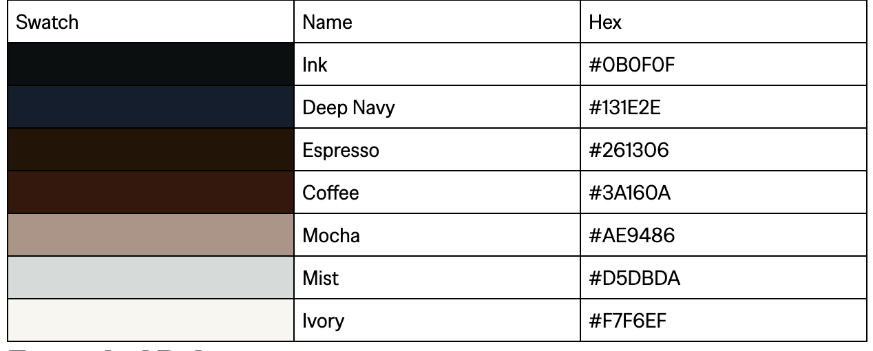
Seven colors make up the current palette. It runs from deep inks through warm browns to a soft cool gray and an ivory base.
Extended Palette
Three ramps extend the core colors for tints, shades, and backgrounds.
Mocha Ramp (warm accent)
Eleven steps, 50 through 1000. Three core colors anchor the ramp: Mocha sits at 400, Coffee at 900, and Espresso at 1000.
Neutral Ramp (cream to ivory to ink)
Eleven steps, 0 through 900, running from cream through ivory into ink.
Mist Ramp (cool neutral)
Three steps: 100, 200, and 300. Mist (#D5DBDA) is the 200 step.
Status colors (muted, editorial)
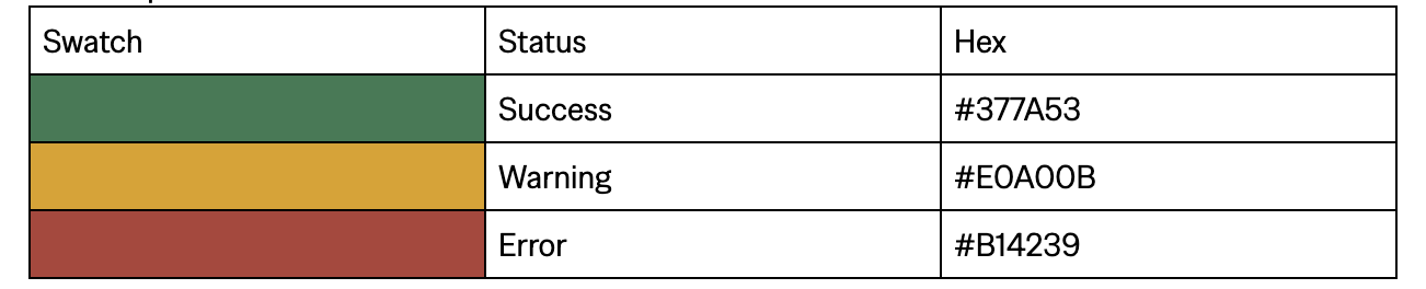
For success, warning, and error states. These are muted on purpose so they sit comfortably inside the editorial palette.
Legacy Marks
The blue and teal marks remain in circulation but are being phased toward the warm palette. Use them sparingly, and only for links, buttons, and CTAs.
